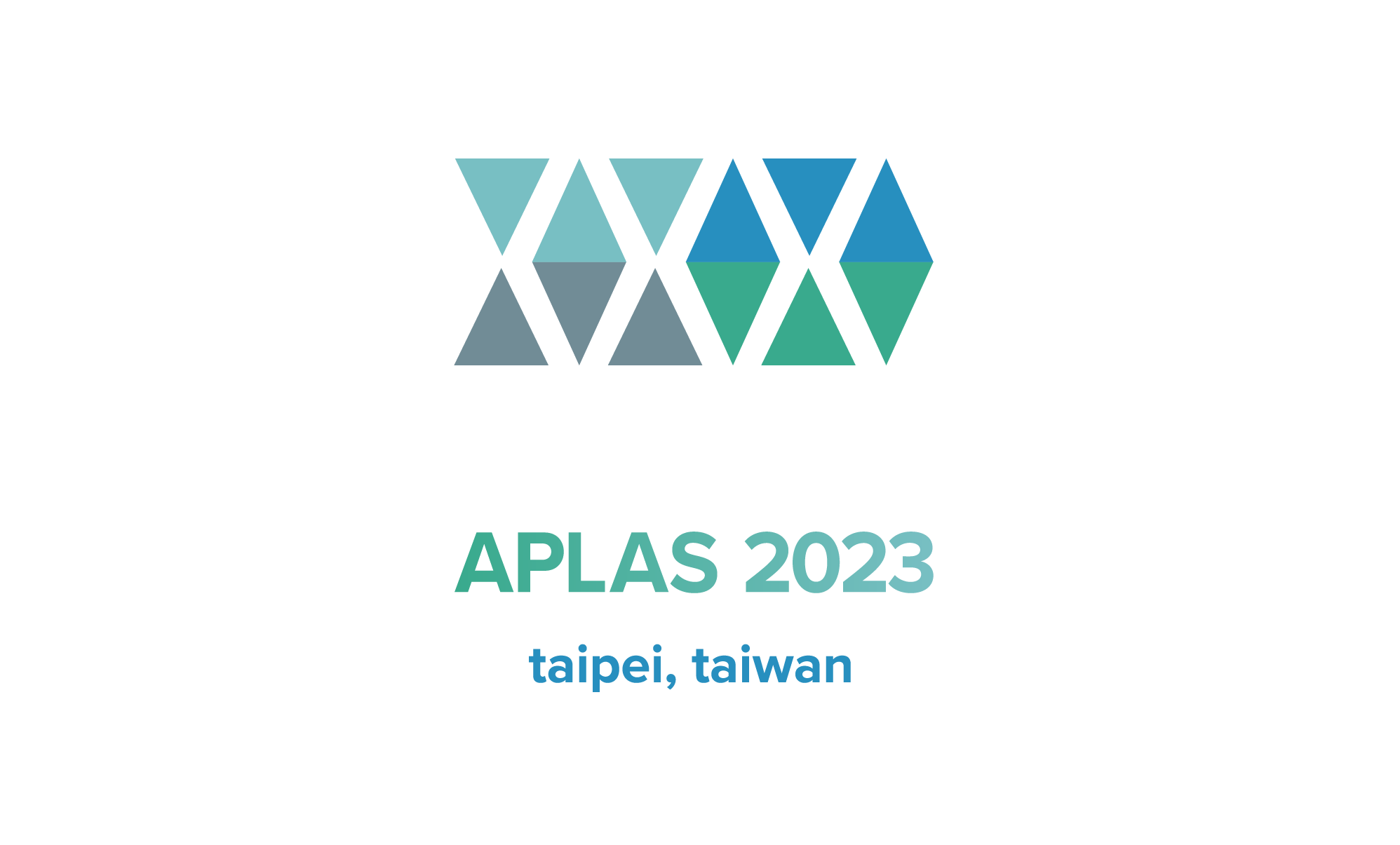
About the APLAS 2023 Logo
Designed by Lynchwan (林川) and Xiaoya Chu.
Water and Fire Already Fording 水火既濟

The concept is inspired by triangle patterns in counted cross-stitch of Taiwanese aborigines. The overall shape is a forward-pointing arrow. A pair of triangles forming an hourglass shape (⧖) denotes yin, or zero, while a diamond shape (⟠) denotes yang, or one. Together they form the binary number 010101, or 21 in decimal — since this is the 21st APLAS.
This yin-yang combination also constitutes Hexagram 63 (䷾) in I Ching, “Already Fording”, with lower trigram “Fire” and upper trigram “Water”. With this hexagram, which symbolizes harmony and stability, the designers wish peace and prosperous to the world.
Color scheme — come rain or come shine: inspired by the dynamic/tranquil, high/low contrast of the posture of the famous sculpture “Tai Chi”, created by Ju Ming and displayed in Academia Sinica, the designers chose four “landscape colors” of Taiwan. The four colors can be split, according to energy contained in the environment, into two groups: sunny sky/mountain and overcast sky/ocean, representing two forms of yin and yang.
造型概念來自於台灣原住民工藝編織十字繡三角紋,整體為前進的箭頭。拆開來看,頂端相對的三角形「⧖」暗示為陰爻 (0),菱形「⟠」為陽爻 (1),組成二進位:010101= 21,代表 APLAS 第 21 屆,亦為周易六十四卦之六十三『水火既濟』,卦象是「調和與安定」。設計者以此 logo 代表天下泰平的想望。
配色方案 — come rain or come shine: 由中研院中庭的朱銘「太極」系列靑銅雕刻的動靜高低姿態發想,設計者選擇台灣的四種「地景色」,依照環境中藴含的能量,分為晴朗的天空/山巒以及陰雨的天空/海洋,各代表兩種「陰」與「陽」的型態。